Charcoal Techniques Explored: Tips, Tools and Surprising Discoveries
- Louise Hancox

- Jan 30, 2024
- 7 min read
Do you remember the first time you stepped into a playground? The excitement of endless possibilities, the thrill of trying something new?
That's exactly how I feel as I dip my artistic toes into the world of charcoal. It's a playdate with shadows, a rendezvous with contrast, and a chance to let my creativity run wild on the monochrome canvas.

I love working with pastels and I’m developing a soft but realistic style that feels very authentic to me. But it takes time and sometimes I think it would be nice to just do a looser, quicker study whilst still capturing the emotion of a piece.
What about charcoal?
As I navigate this new playground of shadows, I invite you to tag along, explore with me, and perhaps rediscover the joy of creating art without the fear of the unknown.
Are you ready to play with shadows and dance with contrasts? Let the charcoal adventure begin!
Materials: Your Playground of Possibilities
Stepping into the realm of charcoal art felt like entering a playground of endless possibilities.
Just as a seasoned explorer chooses the best tools for a thrilling journey, I encourage all artists to invest in the highest quality materials they can afford.
In this artistic playground, the tools become trusted companions, enhancing the joy of the creative process.
Art Supplies - 3 Reasons Why Quality Always Beats Quantity
1. Simplify your Creative Process: Opting for fewer, high-quality supplies simplifies and streamlines your creative process. Instead of navigating through a multitude of options, focus on the tools you trust, allowing your creativity to flow effortlessly.
This intentional selection minimises decision fatigue, letting you dive into your artwork with clarity and purpose.
2. Richness of Pigments: Quality supplies usually come with richer pigments, allowing for deeper and more vibrant tones and shades. For tonal artwork, the intensity of the black and the subtleties in greys play a crucial role in creating a visually stunning piece. Higher-quality charcoal ensures that the pigments are consistent, contributing to the overall richness of the artwork.
3. Durability and Longevity: Quality materials tend to be more resistant to breakage and crumbling, providing a smoother and more reliable drawing experience. Additionally, artwork created with high-quality charcoal is more likely to stand the test of time without fading.
Building Your Charcoal Kit
Before you dive into my world of shadows, let's talk about the essentials.
Here's a glimpse of my basic charcoal kit that I used to get going with this medium.
You can actually think of your kit quite simply.
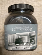
Pigment: I used charcoal powder, charcoal pencils and (my favourite that I'm modelling above) "chunky charcoal"
Blending tools: I like blending stumps, make-up brushes and my good old fingers!
Highlighters: You don't see any white charcoal in my kit. I tried it but didn't like it. For highlights, I loved the kneadable eraser, the little Tombow erasers and the Derwent Electric eraser.
The only other essential is a fixative. The silky charcoal on a silky smooth surface needs a protective hug, securing its place in the art world, so this has to be part of your kit.
Here are some links to my basic charcoal kit.
Cretacolor Charcoal Powder: https://amzn.eu/d/97n7tEF
Conte a Paris Charcoal Pencils: https://amzn.eu/d/i9Xe4GP
Cretacolor Chunky Charcoal: https://amzn.eu/d/63d1OpO
Tombow Eraser Round: https://amzn.eu/d/hU4Vac1
Tombow Eraser Rectangular: https://amzn.eu/d/3fEqiEs
Derwent Electric Eraser: https://amzn.eu/d/doP9dgX
Faber-Castel Kneadable Eraser: https://amzn.eu/d/8eQmU81
Blending Stumps: https://amzn.eu/d/6eguXlC
Makeup Brushes: https://amzn.eu/d/6QaYewv
Winsor & Newton Fixative: https://amzn.eu/d/hcrfnA9
Choosing Your Surface
Selecting the right paper proved to be a crucial decision. I began with two types of hot-pressed watercolor paper. Both professional quality but not ideal for charcoal in my experience. I simply couldn't get the smoothness I wanted.

Seeking guidance, I reached out to the incredible charcoal artist, Tim Walker, who recommended Bristol Smooth.
This paper quickly became my favourite. With its smooth lay down, ease in building layers, and a refined result, it transformed my charcoal experience.

Strathmore Bristol 400 Smooth: https://amzn.eu/d/0BQE4gm
Additionally, I have a Moleskin sketchbook, a petite 13 x 21cm (5 x 8 inches), intended for little loose sketches. Although I should have opted for a larger size, working with it forced me to embrace a looser style.
A testament to this is a charming one hour micro-study I created of our boy, Rudi, during his puppy days.

My Charcoal Adventure: Navigating Shadows and Surprises
I found myself naturally drawn to the pencils, chunky charcoal, and the intriguing charcoal powder. Perhaps, a part of me was seeking a pastel experience using charcoal – after all, aren't we essentially talking about pastel pencils, pastel sticks, and pan pastel equivalents here?
I'd bought vine charcoal and compressed charcoal but they were left to one side. The delicate nuances of vine charcoal and the bold strokes of compressed charcoal are calling me, and yet, I find myself lingering in the comfort of pencils and powder.
One of the things I love about playing with a new medium is the surprises.
Surprise 1: I'm Using Coloured Pencil Techniques! My approach to charcoal more closely mirrored my coloured pencil techniques than pastel.
Those of you that work with coloured pencil on drafting film will be familiar with taking pigment out to create highlights.
Experimenting with subtractive techniques for charcoal felt like orchestrating a symphony of shadows. The charcoal responded to the gentle dance of the eraser, unveiling highlights and creating a delicate interplay of light and dark.
Surprise 2: There's No Place for White Charcoal Working from dark to light, a technique that works wonders with pastels, proved less effective with charcoal. Using white charcoal pencil, and even white pastel pencil, looked artificial alongside the subtle highlights using those subtractive techniques.
Surprise 3: I'm Bound to Realism I expected the silky smoothness of the charcoal under my fingertips, the delightful messiness that came with every stroke, to liberate me from my need for detail and realism.
But the pursuit of looseness became a dance with realism. As I immersed myself in the play of shadows, the essence of realism seeped back into my strokes.
This tiger cub study, created on Bristol Smooth, is not the loose piece I imagined I might create, but it contains within it the joy of exploration.

"Elusive Echoes"
Charcoal on Strathmore Bristol 400 Smooth
[Reference: Steve Clarke Wildlyfe AI]
I called this piece “Elusive Echoes”. The title suggests not just transient nature of a moment of play for the tiger cub, it encourages viewers to engage with the artwork and discover the hidden whispers within its strokes and shadows.
The Dance of Shadows: A Charcoal Revelation
And then I revisited a past artistic struggle. I had attempted this piece before, employing the tag team of coloured pencils and pastels, but it left me a tad underwhelmed.
I put to one side the thought of a loose style using charcoal and embraced what I loved about my experience so far.
Working with charcoal was like sculpting shadows. Charcoal on, charcoal off - unveiling the beauty within the shadows.
And this version worked so well. I watched with joy as the gorilla emerged, a testament to the magic concealed within the dance of those shadows.

"Infinite Shadows, Singular Light I"
Charcoal on Strathmore Bristol 400 Smooth
[Reference: Mike Rodenburgh at Wildlife Reference Photos]
I love what I was able to create.
It made me curious though.
How different would it be to create a version of this piece using just black and white pastel? Well - here it is...

"Infinite Shadows, Singular Light II"
Pastel on Dark Grey PastelMat
[Reference: Mike Rodenburgh at Wildlife Reference Photos]
Both pieces capture the depth and complexity of the gorilla's character. The play of the shadows represent layers of the gorilla's experiences and emotions. But, more than that, the light hitting the gorilla's profile and fingers symbolises a singular, poignant moment, offering a glimpse into the gorilla's soul.
Charcoal is The Drama Queen, Pastels are The Soft Poet.
Both mediums offer versatility, but in different ways. Charcoal is bold and expressive, while pastels bring a softer, more nuanced touch. Depending on your artistic mood, you can choose the medium that resonates with your vision.
Here's what I found in the two experiences.
Charcoal Thrives on Drama. Its intense black strokes can create striking contrasts, making your subjects pop with a cinematic flair. The deep, velvety darkness adds a mysterious touch to your artwork.
Charcoal Loves to Play. Its silky nature allows for seamless blending, enabling you to transition smoothly between shadows and highlights. The blending is almost like a dance, giving your artwork a cohesive and expressive look.
Mistakes Become Miracles with Charcoal. I had a few “Oops” moments with charcoal. But I learned that charcoal's got your back. Mistakes often turn into beautiful accidents, adding an unexpected layer of depth and complexity. Embrace the unpredictability and let your creativity flow.
Pastels Have a Gentle Elegance. They bring a softer, more delicate touch to your black and white creations. With gentle strokes you can create an ethereal quality, perfect for capturing subtle nuances and emotions.
Pastels Provide a Tapestry of Texture. They help you weave a sensory experience. The ease of adding texture with layers of pastel is particularly useful when you want to convey the feel of fur, feathers or other intricate details.
Pastels Appreciate a Bit of Order. While charcoal loves to play, pastels offer precise control over details, allowing you to capture fine lines and intricate elements with finesse. It's like painting with a gentle whisper.
The Play of Artistic Exploration
In the play between intention and exploration, my objectives evolved.
What began as a quest for looseness transformed into a discovery of the delicate balance between structure and fluidity.
Whether wielding the more expressive charcoal or the soft elegance of pastels, it's about embracing the unique characteristics of each medium to bring your artistic vision to life.
So, which version speaks to you more?
I'd love to know. Share your thoughts in the comments below and let's celebrate the diverse beauty of artistic expression.
As a personal note, I delved into the world of pastels two years ago, gradually building my skills with each stroke of the pencil. While I feel like I'm starting to grasp the medium, there's still a vast amount of learning ahead. In contrast, my journey with charcoal began just a month ago—more of a playful exploration than a fair comparison. Perhaps, in two years, I'll revisit this artistic crossroads and share how the dance with shadows has evolved.
And if you’re intrigued to follow along in my playground of creative possibilities, then do sign up for my newsletter to get the inside track.
For those interested in exploring pastels, I highly recommend Jason Morgan and Zara Toms.
As for charcoal, my experience has been more about experimentation, but I do recommend checking out the fabulous YouTube videos of Daniel Wilson:
So tell me - have you tried charcoal art before? What surprises or challenges did you encounter?


Well-structured and practical guide that makes choosing the right tool and techniques for painting much easier. Enterprise Cloud Solutions
Kabar4d udah terbukti aman, gue udah main lebih dari 6 bulan di sana.
You write as beautifully as you paint Louise 💕 I will look forward to you publishing your first book! Charcoal looks very tempting, I need to start exploring different mediums and am looking forward to trying out a set of Unison pastels. Thank you for the inspiration 🙏🥰x